CSS clamp() Fluid Typography Calculator
Generate a CSS clamp() value for font sizes that scale smoothly between viewports · free, no signup
See CSS clamp() Fluid Typography Calculator in action
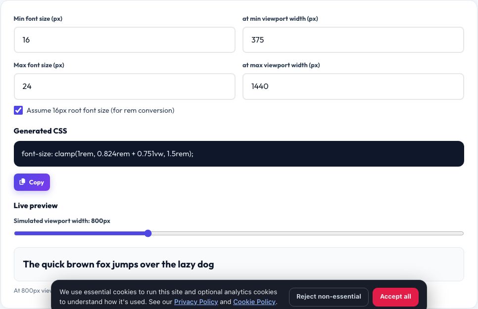
Free CSS clamp() Fluid Typography Calculator
Fixed font sizes look too small on large monitors and too large on phones, and media-query breakpoints for text size create sudden jumps instead of smooth scaling. The CSS clamp() function solves this in one line by scaling a value fluidly between a minimum and maximum based on the viewport width, but writing the required vw-based formula by hand is fiddly and error-prone.
Enter your minimum font size at your minimum viewport width, and your maximum font size at your maximum viewport width, and this tool calculates the exact clamp(MIN, PREFERRED, MAX) CSS value for you, using rem units for accessibility. A live preview box shows the resulting text size and lets you drag a slider to simulate any viewport width in between.
Key features
Correct clamp() formula
Generates the precise vw-based preferred value, not a rough approximation.
Live width slider
Drag to preview the exact rendered size at any viewport width.
rem-based output
Keeps text scalable with the user's browser font size setting.
Copy-ready CSS
One click copies the finished clamp() declaration.
How to use it
- Enter your minimum font size and the viewport width it applies at.
- Enter your maximum font size and the viewport width it applies at.
- Drag the slider to preview scaling in between.
- Copy the generated clamp() CSS into your stylesheet.
Worked example
Example
Min 16px at 375px viewport, max 24px at 1440px viewport → font-size: clamp(1rem, 0.821rem + 0.85vw, 1.5rem);
Who uses this tool
Front-end developers
Add smooth, accessible fluid type scales without a media-query ladder.
Designers handing off specs
Communicate a min/max range instead of fixed breakpoint sizes.
Design-system maintainers
Generate consistent clamp() values for a whole type scale.
Tips for the best results
- Use clamp() for headings and hero text first — the effect is most noticeable on large type.
- Keep the min and max reasonably close (not more than roughly 1.5x apart) so scaling stays smooth and readable.
- Test the live preview at your real content's narrowest and widest breakpoints, not just the extremes.
- Combine with rem-based spacing for a fully fluid layout, not just fluid text.
Common mistakes to avoid
- Using px inside clamp() instead of rem, which breaks user-controlled browser zoom and accessibility settings.
- Setting the minimum and maximum viewport widths the wrong way round, which inverts the scaling direction.
- Forgetting that clamp() needs three values in order: minimum, preferred, maximum — swapping the order breaks the function.
Why use AZRS QuickFix?
It is 100% free, needs no signup and has no watermark or usage limits. The tool runs in your browser, so what you type stays on your device, and it works on phones, tablets and desktops. New tools are added every week — bookmark this page or browse the full QuickFix toolbox.
Frequently asked questions
What does clamp() actually do?
It picks the middle of three values — a minimum, a fluid preferred value, and a maximum — so it scales smoothly between the min and max but never goes outside that range.
Why use rem instead of px?
rem respects the user's browser font-size setting, which is important for accessibility; px ignores it and looks the same regardless of that preference.
Does clamp() work in all browsers?
Yes, it is supported in all modern browsers (Chrome, Firefox, Safari, Edge) released since 2020.
Can I use this for spacing, not just font size?
Yes, the same formula works for any CSS length property such as padding or margin — just treat the numbers as your spacing values instead of font sizes.
What happens below my minimum viewport width?
The value stays fixed at your minimum size — clamp() never goes smaller than the minimum you set.
Is a JavaScript resize listener needed for this to work?
No, clamp() is pure CSS and recalculates automatically as the browser is resized — no JavaScript required.